|
This project was where I had to use all kinds of colors to make a artwork with it. It was a bit hard for me but it was also fun. For the color name assignment, I had to use colors and write their RGB and their HEX code. And for my color scheme assignment, I had to see which colors will fit good and I used the website Adobe Color. In Adobe Color, I found monochromatic, analogous, complementary, and triadic colors to make a color combination. Color Name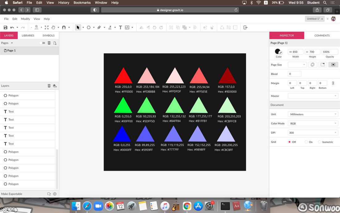 Color Scheme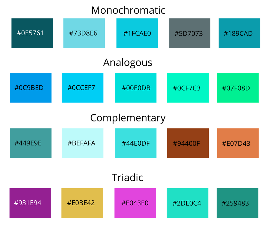
0 Comments
For the exercises for pen tool, I traced them all with my pen tool and made a line tracing over the super hero icons. And for my last summative, I was thinking how it will feel like if we do soccer with a bowling ball. Just being stupid for one second. I combined two images and cut out the soccer ball and the background that was there in the bowling ball. And I put the bowling ball without the background in the place where the soccer ball was. Some of the difficulties I had was that sometimes, when I cut off the balls, I practiced cutting them off from the exercise but the other shapes made me challenge. The pictures were from Pixabay. 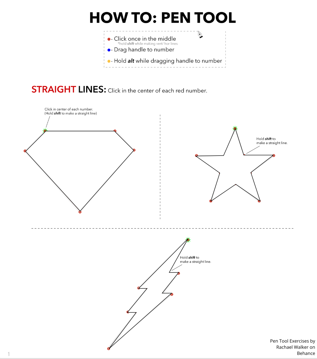 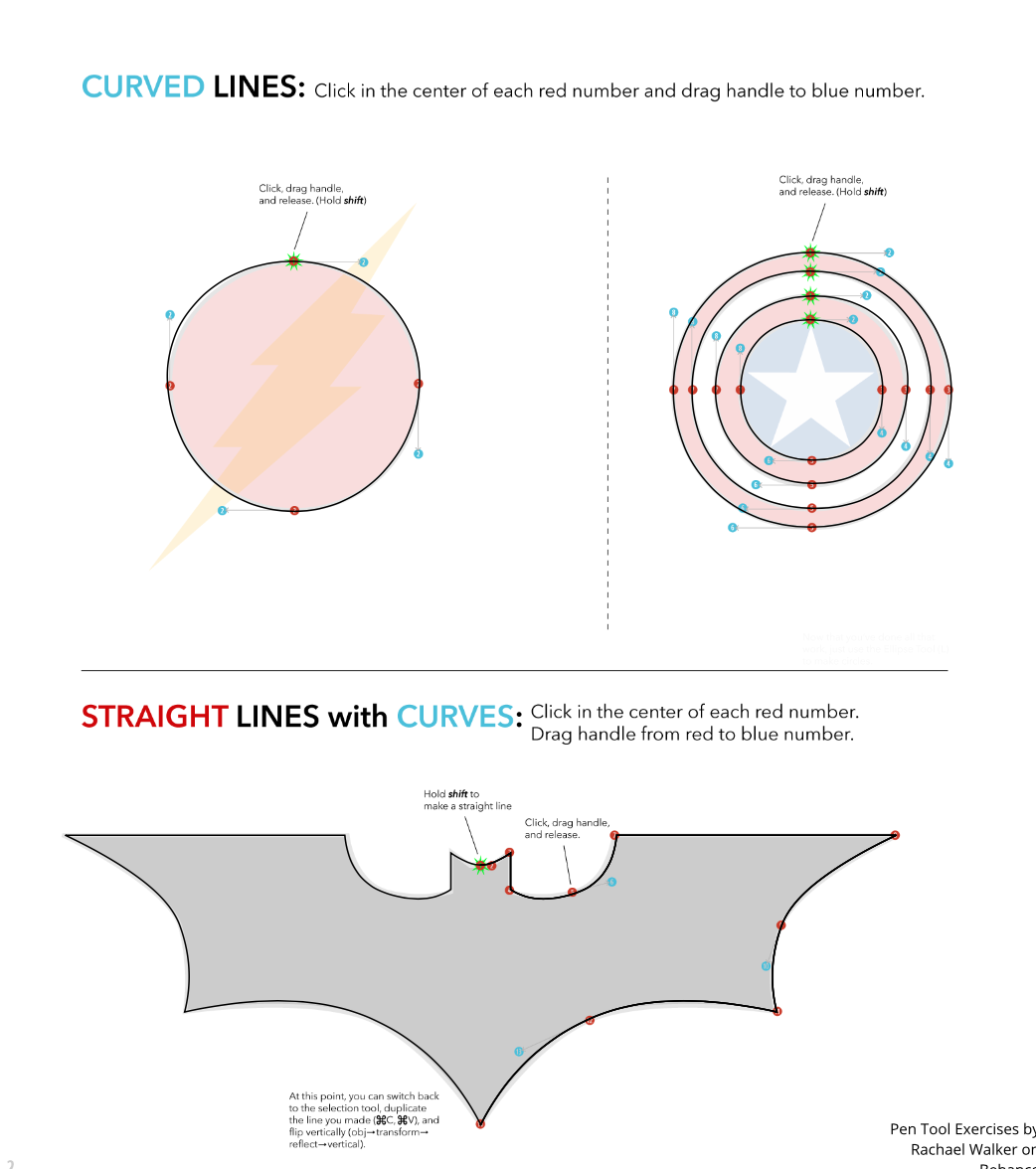 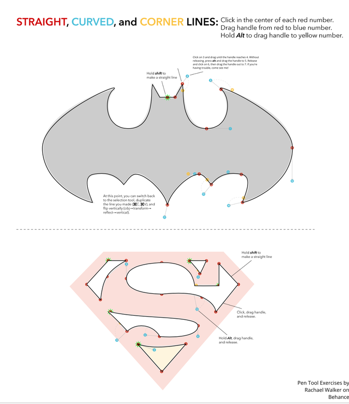 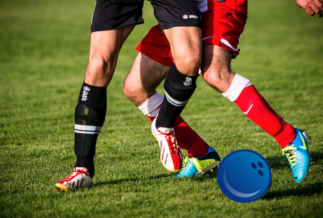 https://pixabay.com/vectors/bowling-ball-ninepins-tenpins-bowl-150238/
https://pixabay.com/photos/football-clip-football-boots-soccer-606235/ Typography is the appearance of the letters used. I think Typography is important because if we use typography, there are many things that we can express from only the letters we use. Not only this, if we use the proper typography, we can easily understand and read. The quote "Each font has a personality and a purpose," I think this means that every font has their own personality and every one of the are different and unique. The 5 different types of font I learned was Serif, Sans Serif, Monospaced, Handwriting, and some fonts for designing. Both Serif fonts have a little line at the end of the letters. Monospaced is a font where all letters have equal and same amount of space from each other. Design fonts are the fonts not commonly used but used when you try to create something new or trying to look unique from other titles. And last, handwriting font. This basically just looks like a handwritten font from an actual person writing something. Typography ComparisonIn this activity, I was assigned to use Gravit and write down 5 different fonts and different examples about them. My main word was "Hello" and I had to change fonts for every hello I had to type in in this assignment. 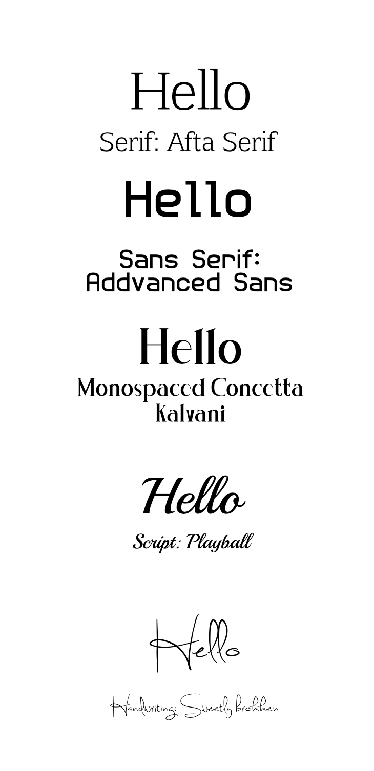 |
Archives
June 2021
Categories
All
 This work is licensed under a Creative Commons Attribution-NonCommercial-NoDerivatives 4.0 International License. |
